Bacon and Games

Tag: tips

Trainyard Developer Plays Show and Tell

Matt Rix is the guy behind Trainyard, a puzzle game for the iPhone. Besides the fact that it’s on sale for $.99, it’s a heck of a lot of fun. If you don’t have it you should check it out. However this isn’t a review, he’s got enough of those.

Matt was nice enough to share his Trainyard story with the rest of us mortals down here trying to strike app store oil. Beware, Matt’s story is one of those dangerously inspiring stories that’ll make you feel like you too can make millions overnight if you have a good idea. Let me spare you the suspense; you can’t. Well, you probably can’t. As long as you go into his article thinking of it as less of a blueprint and more of a good story, you’ll find it interesting. Don’t get your hopes up if you’re looking for hard sales numbers. It seems yet another developer has been persuaded to keep their detailed sales data to themself. Surprise surprise.

One last thing before I close… Matt talks briefly about Cocos2d, the freely available framework for building iPhone apps. He described it as “similar to Flash”, which caught my attention. It comes packed with physics engines Box2D and Chipmunk, has tilemap support and includes hooks into all sorts of other iPhone and game related needs. I intend to look into it and based on Matt’s recommendation I’ll suggest that any other Flash developers interested in iPhone development go ahead and give it a look as well. Let me know what you find :)

How to Simplify Programming Challenges

I recently had a young programmer named Jack (that’s not his butt to the right) ask me for help with a game he’s been working on. I don’t want to give away too much about his unreleased game, but for the sake of discussion I have to at least tell you that it involves a big ass rock that goes around smashing the crap out of different shit. (and 2 sentences in I’ve hit my butt reference limit for this article)

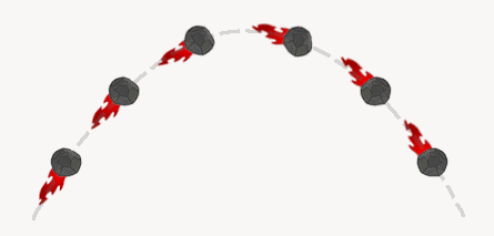
The version he shared with me was pretty far along but he was stuck on one particular detail; getting the rock’s tail to point in the proper direction. Essentially he wanted the tail to point away from the direction the rock was moving, similar to the tail a roll of toilet paper might draw when thrown through the air.

This is a fairly common challenge in game programming and I, like many other game programmers, have done this in the past. I have code that I would have happily handed over to him, but after speaking to him we decided it would be more valuable for me to push him in the right direction rather than just take his FLA and fill in the blanks. I’ll spare you the Chinese proverb about teaching a man to fish..

On Problem Solving
Whether you’re programming super complicated banking software or just making a simple number guessing game, the process is the same.

  1. What do you need to do? Define the challenge.
  2. What do you know? Assess the tools and info you have at your disposal.
  3. Do you have all the pieces? Figure out if what you have can be used to solve the problem.
  4. If yes: Create a plan for using what you have in order to solve the problem.
  5. If no: Break the problem into smaller challenges and return to step 1

This is of course a grotesquely generalized version of problem solving. But what’s important to note is that by asking the right questions you can distill ANY problem into simpler more manageable parts. No matter how complex, the solution to all programming challenges (and most real life ones too!) is simply the sum of smaller problems solved in the right order.

Asking the Right Questions
Let’s take a look at Jack’s problem and how we might break it down into a solution.
1. What do you need to do?
We need to rotate the rock so that it’s “facing” the direction it’s moving.

This is a “plain English” definition of the problem, which is the best place to start, but before we can continue we’ll need to convert the definition of our problem into something we can quantify.

Since movieClips have a rotation (_rotation in AS2) property, it’s likely that we’re going to need to use this to point the clip in the right direction. We know that the rotation property accepts degrees, so we’re probably looking for an angle.

The real answer to Question #1 is:
“We need to figure out the angle at which the rock is moving.”

2. What do you know?
In this step you’ll want to keep the answer to Question #1 in mind, but it’s perfectly fine to be liberal about listing the things you know. You can sort out the relevant data from the irrelevant later, but you never know what piece of information might spark an idea so to start it’s a good idea to list whatever comes to mind. (be creative!)

  • Since the rock is a movieClip we have access to all of its properties; rotation, x, y, etc. These 3 are the most likely to be useful, but remember movieClips have all sorts of properties.
  • It’s moving so we probably know its speed in the x and y directions
  • Our rock might be in an environment with some rules, such as gravity, windspeed and friction. It’s our world, so we’d know all these things too.
  • We also probably know who shot Mr. Burns. Who doesn’t? But I can’t imagine that’s going to do us any good.

3. Do you have all the pieces?
Now that we’ve listed the stuff we know, we have to sift through it for something that might help us calculate an angle.

If we can define a line, we can calculate an angle. Well, a line is defined by two points so let’s look at what we collected in Question #2 and see if we can come up with two points; two points that define the path of our rock.

We have the current location of the rock, via the x and y properties of the movieClip, which would be the end point of our line. We need the starting point to complete the line, which we don’t have in our list.

This means that the answer to Question #3 is “No”. We have to put this part of the problem on hold for now and refine our problem into a more specific question:

Where can we get the starting point so that we can draw a line?

Luckily for us this is an extremely simple problem. On every frame we’re going to be updating the position of the rock. So all we have to do is store the current position of the rock before we move to the next frame. (I recommend a variable called lastPosition)

If we do that, we can add lastPosition to the list of things we know, which gives us two points. We’ve got our line! This means we can calculate an angle, which means we can figure out what angle we need in order to point the rock in the right direction. We’re almost done!

The next thing we need to do is write a function into which we can pass our starting and ending points that will give us an angle in return. Since this isn’t a math lesson, it’s a lesson about learning to fish (OK I lied about the proverb), I’ll just write the function for you. They’re adapted from one of my favorite books, Keith Peters’ Foundation Actionscript 3.0 Animation: Making Things Move! (I’m also a big fan of this book) Both are fantastic resources for math, physics and other common game programming stuff.

1
2
3
4
5
6
7
8
9
10
11
12
13
14
15
// AS2
function getAngle(startX,startY,endX,endY):Number{
	var dx:Number = endX - startX;
	var dy:Number = endY - startY;
	var radians:Number = Math.atan2(dy,dx);
	return radians*180/Math.PI;
}
 
// AS3 
function getAngle(st:Point,end:Point):Number{
	var dx:Number = end.x-st.x;
	var dy:Number = end.y-st.y;
	var radians:Number = Math.atan2(dy,dx);
	return radians*180/Math.PI;
}

The last thing for us to consider is how to setup the rock clip. If we set it up so it’s facing to the right in its default position [rotation=0], the angle we get back from our function will point the rock in the correct direction.

There you have it, a seemingly complex problem broken down into a few manageable parts.

This problem was small, but the process is applicable to a project of any size and challenges of any complexity. The key is accurately defining the things you need to achieve. From there you can survey what you have at your disposal and see if what you have can be used to get what you need. If you can’t, you need to define more specific questions until you have all the tools and info you need to finish the job. It’s just that simple.

Now go, build the next Farmville or twitter or Google Wave, you know…something really useful. Oh, one more thing, bedonkedonk… I lied about the butt thing too ;)

Thanks to Ajay Karat for lending me his rock and fire art for the trajectory sample above.

User Interface Design Tips for Your Game

A good UI doesn’t require the user to think about how to access or interpret the information and features of your game. What the user needs should be readily available and interacting with it should be intuitive. Every user is different and most of them will not interact with the game exactly as you intended. Making your UI as simple and flexible as possible will allow the UI to fade into the background and help draw the user into the game’s experience. Here are a few things to consider when designing the UI for your game.

Give Users Input Options
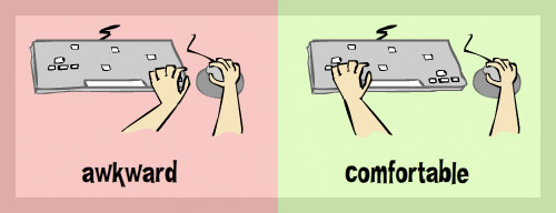
Some people are on laptops with small arrow keys. Some people are right handed and some evil people are left handed. Some have a trackpad but no mouse or a keyboard with only one shift key. Giving your users options helps them find a configuration that best suits them. The simplest example is using the arrow keys to move versus using the WADS keys. This is especially true if your game requires simultaneous mouse and keyboard use.

In addition to basic physical comfort, it’s nice to let users decide which actions their dominant hand will be responsible for and which actions will be relegated to that other hand *shudder*. If your game is a simple run/jump platformer, consider letting the user choose between the [arrow keys + Z] -OR- the [WADS keys + L]. You can often get away with leaving both configurations active and not even have to ask the user to select one. This is sometimes the best option because most people will intuitively try the WADS or arrow keys when a game begins and you can safely assume they’ll try their preference first. There’s nothing more comforting than guessing at a game’s controls and finding they’re exactly what you expected them to be.

Give Users Audio Control
There’s no question that audio plays a crucial role in great game design. Anyone who has ever played Left 4 Dead and had their heart jump into their throat when the dreaded tank music kicked in would probably agree [well fuck, I better find some health] . But sometimes sound just isn’t an option for your user (I know I hope people are playing my games while they should be working) and it’s better to have them play the game without sound than to not play it at all. It’s also nice to give users the option of muting just the background music or just the sound effects. Sometimes all I want to hear is Hall & Oates but still want to hear zombies exploding because I’m crazy like that. Same as everything else regarding your UI, don’t make toggling sound a chore. If the game doesn’t use the mouse, don’t make the user click something to toggle the sound and vice-versa for a game that doesn’t use the keyboard. The best approach: allow the user to toggle sound with keystrokes OR a mouse click.

Make Binary Keyboard-Driven Selection as Clear as Possible
Whew, that was a mouthful. Let me ‘splain. No, there is too much. Let me sum up. Early DVD menus that offered wide or fullscreen options on startup were guilty of this. If you have 2 options and are using the keyboard to choose between them, make sure it’s painfully clear which option is selected and which is not. Consider the following scenarios (you will have to click on the Flash object in order for it to receive keyboard input…ironic, I know)

Ambiguous

This movie requires Flash Player 9

Clear

This movie requires Flash Player 9

You don’t ever want your user to wonder which option is currently selected, especially if the options are “continue” and “start over”.

Here are a few remaining thoughts:

  • If you absolutely must have an instruction screen, let your user start your game from there. Do not force them to go back to your main menu just to start the game
  • Programmers love to type dummy text into dynamic text fields at author-time to see how many characters their field will hold. Remember to remove these fillers before you finalize your game. When your game starts showing a score of “00000000000” and then jumps to “5” it’s a jarring transition that doesn’t deserve the user’s attention but will likely grab it.
  • You probably want your games to be so addictive that they evoke that just-one-more-game-I-know-I-can-hurl-that-cat-past-the-barbed-wire replay mentality. So when you create a game that achieves this, make sure you let the user restart as easily and quickly as possible. If it’s a keyboard game, don’t force them to grab the mouse and click. It’s usually best to give them the option to click or press space to restart. If you’ve got their attention, keep them drooling and mashing the keyboard for more :P
  • When designing audio for your game, don’t use headphones. Turn your speakers on and play some music at a reasonable volume. Then design your game’s audio volume within a reasonable range of that. How many times have you opened up a Flash game and been blown away by the game’s music, or conversely been blown away by your own music after quitting the game and resuming iTunes?
  • When displaying large numbers, use commas. 15,389,023 is a lot easier to read than 15389023. I’ve provided a function below that will format a number with commas. I wish I knew who the author is so I could credit him/her. I’ve had it so long (this is converted from AS1) that I don’t recall where I picked it up. Sorry noble mystery coder :(
1
2
3
4
5
6
7
8
9
10
11
12
// adds commas to a number, returns a string for display
public static function addCommas(number:Number):String{
    var numString:String = number.toString();
    var result:String = '';	
    while (numString.length > 3){
        var chunk:String = numString.substr(-3);
        numString = numString.substr(0, numString.length - 3);
        result = ',' + chunk + result;
    }	
if (numString.length > 0) result = numString + result;	      
return result;
}

As I said in 5 Things Flash Game Developers Often Forget, none of these things will make or break a game. But the more little things you get right, the better your game’s overall experience will be.

5 Things Flash Game Developers Often Forget

Before I get into discussing larger scale game design theory, I wanted to put up a quick post about some of the most common things Flash game developers forget to do. None of these will save a bad game, nor will they completely ruin a good game but forgetting them will definitely take a bit of the shine off an otherwise polished game.

  • Embed fonts used in dynamic text fields: If you forget to embed a font used by a dynamic textField, users who do not have this font installed on their machine will see an ugly system font in its place. When this happens it really stands out, even to the casual observer. If the kerning and size of the default font is dramatically different than the font you chose, you run the risk of your textField being too small to display the data being passed into it. Now your text is ugly and incomplete…d’oh! This one is very easy to overlook because fonts you won’t notice a missing font on your own computer (because it’s not missing for you). It’s always a good idea to check out your game on a friend’s computer.
  • Make dynamic textFields unselectable: Dynamic textFields are most commonly used to simply display information; scores, numbers of lives remaining, subtitles, etc. So 9 times out of 10 these textFields need to be seen but do not need to be interactive. Neglecting to make textFields like these unselectable will not cause any problems, but when the mouse hovers over a textField and the cursor changes to the i-bar (Text Selection Cursor) it not only looks unprofessional but it detracts from the flow of the game. This can be especially tragic in mouse-driven games if the user is clicking around to fire a weapon and their cursor is constantly changing each time a score pops up under their mouse. This one is also frequently missed because dynamic textFields are by default selectable, both via code and at author-time. The exceptions are web safe fonts, which I consider the fonts appearing first in the font-family lists (Ex: Helvetica does not come with a PC).
  • Use solid hit states for all buttons: This one seems like a no-brainer yet I still see a handful of games every day that forget this one. It’s most commonly a problem with buttons that are only text. Flash has gotten smarter over the years and will now use size of the textField as the hit state if you don’t define one. However if you decide later on that you want to break your text apart to save on file size, you’ll find yourself left with the dreaded flickering mouse cursor on rollover. Rule of thumb: give all your buttons a simple solid rectangular hit state as soon as you create them.
  • Pixel fonts belong on whole numbered coordinates: Pixel fonts look best when positioned on whole numbered X and Y coordinates. They’re designed to look sharp when positioned evenly on the pixels of your monitor. Since Flash allows you to position at the sub-pixel level (Ex: mc.x = 2.5) you can cause a sharp pixel font to become blurry by positioning it between pixels. Pixel fonts can also become blurry when scaled or set to sizes not intended for use by the designer (some general info on pixel fonts can be found here). If your pixel fonts don’t look sharp, check the coordinates, scale and size of your font. If your textField is nested in a movieClip, make sure that both the textField AND the parent clip is on even numbered coordinates.
  • Disable the default context (right-click) menu: By default your Flash games will, among other options, offer the user playback controls. Depending on how you’ve built your game, a user might be able to break your game by selecting “play”, “forward” or “back”, moving the playhead of the main timeline independently of your game logic. Besides providing an opportunity for users to accidentally break your game, the default context menu is bulky and well….default. Disabling the default settings reduces the number of items in the menu to a paltry 2, both of which are completely harmless. If you’re feeling saucy drop a credit to yourself or an easter egg in there. Whatever the case may be, take a few minutes to cleanup this potentially harmful and ugly default menu. Your flash developer peers will respect you for it :) [customizing context menu AS2 | AS3]

If you already take these things into consideration, fantastic! Stay tuned for some posts more your speed, though I run into these things frequently enough that they were worth covering. For you new Flash developers (or old ones with bad habits) please try to consider these simple adjustments for your future projects. You wouldn’t spend months detailing a car only to leave the last few inches of the hood unpainted, would you? One tiny missed spot might go unnoticed, but miss too many and you’ll end up with a bad paint-job that ruins your beautiful restoration. The same is true of your games. If you’ve spent months building a game, don’t let a few simple blemishes tarnish the experience. Every time the i-bar pops into view or a button roll-over misbehaves the user is yanked out of the game experience and reminded that they’re in an application. As a game designer you’re building a game, not a Flash game or a java applet. You should strive to help your users lose themselves in your game by keeping them away from anything that might remind them of reality. After all, that’s probably why they’re playing your game in the first place.

Copyright © 2024 Bacon and Games

Theme by Anders NorenUp ↑